Cropping sounds simple. You trim a photo. You make it fit. Done, right? Not always. If you crop the wrong way, you can lose details forever. That is where Crop View and non-destructive cropping save the day.
TLDR: Crop View lets you see only the part of an image you want, while keeping the hidden parts safe. It is like placing a window over a photo instead of cutting it with scissors. For example, a social media manager can crop one product photo into a square post, a vertical story, and a wide banner without re-uploading or damaging the original. Teams that reuse images this way can save hours each week and reduce repeated editing work by 30% or more.
What Is Crop View?
Crop View is a way to show a selected area of an image while hiding the rest. The full image still exists. You are only changing what people can see.
Think of it like a stage curtain. The actor is still backstage. You just do not see them yet.
In design and photo editing tools, Crop View usually lets you:
- Move the image inside a frame.
- Zoom in or out.
- Change the visible area.
- Keep the original image intact.
- Try many layouts fast.
This is very useful when one image must work in many places. A homepage banner. A profile image. A mobile ad. A product card. Same photo. Different views.
Image not found in postmeta
Non-Destructive Cropping, Explained Like Pizza
Imagine you have a large pizza. A destructive crop is like cutting away the crust and tossing it in the bin. Gone. Sad. Crispy tragedy.
A non-destructive crop is different. You place a square plate over the pizza. You only see what is on the plate. But the rest of the pizza is still there. Wonderful. More snack options.
In image editing, non-destructive cropping means the hidden parts of the image are not deleted. You can come back later and adjust the crop. You can reveal more sky. Show more shoes. Move the face into the center. Nothing is lost.
Why It Matters
Good cropping does more than make an image fit. It changes how people feel about the image.
A bad crop can cut off a hand. Or hide the product logo. Or make someone look like they are trapped in a tiny box. A good crop feels natural. It guides the eye. It makes the point fast.
Non-destructive cropping matters because real projects change. A client may say, “Can we show more of the background?” A manager may ask, “Can this work as a vertical ad?” A designer may need to fix spacing after text is added.
If the crop was destructive, you may need to find the original file again. If you cannot find it, you may need to start over. That is not fun. That is coffee-spilling energy.
Best Practice 1: Always Keep the Original
This is the golden rule. Never crop your only copy.
Save the original image in a safe folder. Then work with a duplicate or use a tool that keeps the source image inside the design. This gives you freedom. You can test bold crops. You can zoom in. You can rotate. You can make mistakes without panic.
Use names that make sense. For example:
- product photo original
- product photo square crop
- product photo story crop
- product photo web banner crop
Simple names save future you from detective work.
Best Practice 2: Crop for the Goal
Do not crop just to fill space. Crop with a reason.
Ask one simple question: What should people notice first?
If the answer is a face, keep the face clear. If the answer is a product, give the product breathing room. If the answer is a mood, keep the background and colors that create that mood.
A crop for a fashion post may focus on the outfit. A crop for a customer story may focus on the person’s face. A crop for a food menu may focus on texture. Crispy edges matter. Sauce matters. Tiny parsley drama matters too.
Best Practice 3: Respect the Safe Area
Every design has danger zones. Text may cover the bottom. A profile circle may cut off corners. A mobile screen may crop the sides.
This is why safe areas are important. Keep key details away from the edges. Leave space around faces, logos, and products.
A quick rule is this: keep the most important part inside the center 70% of the image. This is not perfect for every format. But it is a good start.
Image not found in postmeta
Best Practice 4: Use Aspect Ratios Like a Pro
An aspect ratio is the shape of your crop. It tells you how wide and tall the image is.
Common ratios include:
- 1:1 for square posts.
- 4:5 for tall social posts.
- 9:16 for stories and short videos.
- 16:9 for banners and video thumbnails.
- 3:2 for classic photography.
Crop View makes ratios easier. You can switch from one shape to another without destroying the image. This means one photo can become many assets.
Start with the largest version you need. Then make smaller crops from that. This keeps quality higher. It also helps avoid blurry results.
Best Practice 5: Watch the Edges
Edges are sneaky. They can ruin a crop.
Before you export, scan all four sides of the image. Look for awkward cuts. Half a sign. Half a face. A mystery elbow. A random trash can. A tree growing out of someone’s head.
These little things pull attention away from the main subject. Move the crop a little. Zoom in or out. Clean the frame.
A great crop often feels invisible. People do not say, “Amazing crop!” They just understand the image faster.
Best Practice 6: Leave Room for Text
If your image will have text on it, plan for that early. Do not crop too tight.
Leave open space for headlines, prices, buttons, or labels. This space is sometimes called negative space. It is not empty in a bad way. It is useful breathing room.
Sky, walls, tables, grass, and blurred backgrounds can all be great places for text. Busy areas are harder. Text over busy details can look messy and hard to read.
Use contrast too. Dark text needs a light area. Light text needs a dark area. Simple.
Best Practice 7: Keep Faces Comfortable
Humans are very good at noticing faces. We also notice when faces are cropped badly.
Try not to cut at strange places. Avoid slicing through eyes, mouths, or chins unless you are making a bold artistic choice. And yes, bold choices are allowed. But they should look intentional, not accidental.
For portraits, leave a little space in the direction the person is looking. If they look left, give them room on the left. This makes the image feel calm. If you crop too close in front of their gaze, the photo can feel cramped.
Image not found in postmeta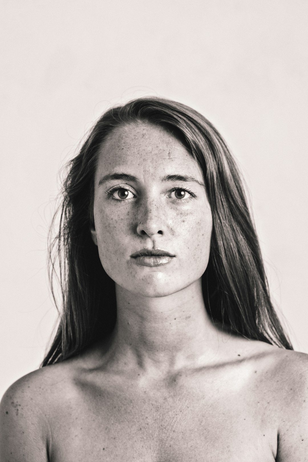
Best Practice 8: Check Every Device
A crop may look great on a large screen. Then it may look weird on a phone.
Preview your crop in the places it will appear. Desktop. Tablet. Mobile. Email. Social feed. Product page.
If possible, test before publishing. Even a quick phone check can catch problems. Maybe the logo is too close to the edge. Maybe the product is too small. Maybe the text covers the best part of the image.
Better to find out now than after 12,000 people see it.
Common Mistakes to Avoid
- Cropping too tight: This leaves no room for layout changes.
- Deleting the original: This makes future edits harder.
- Ignoring the final format: A wide crop may fail in a vertical story.
- Cutting off key details: Logos, faces, and products need care.
- Forgetting text space: Design needs room to speak.
A Simple Workflow
Here is an easy non-destructive cropping workflow:
- Start with the highest quality original image.
- Place it inside your design frame.
- Choose the correct aspect ratio.
- Move and scale the image in Crop View.
- Keep key details inside the safe area.
- Preview on the final device or platform.
- Export the finished version.
- Keep the original and editable file.
This workflow is simple. It is also powerful. It helps you stay fast, flexible, and calm.
Final Thoughts
Crop View is not just a button. It is a smart way to think. You are not cutting your image. You are choosing the best window into it.
Non-destructive cropping lets you experiment without fear. You can change your mind. You can create many formats. You can fix mistakes later. That is creative freedom with a safety net.
So the next time you crop a photo, do not grab the digital scissors too fast. Use Crop View like a frame. Protect the original. Guide the eye. Leave room for change. Your images will look better, and future you will send a tiny thank-you note.