Use Uizard when you need a quick editable mockup from a screenshot, and use Figma when you need clean, production-ready design work. That is the simple answer. Uizard is the speedy sketch artist. Figma is the serious design studio.
TLDR: If you upload 10 app screenshots, Uizard may turn them into editable screens in minutes, but the results often need cleanup. Figma is better after that, because teams can refine spacing, components, styles, and prototypes with more control. For example, a startup redesigning a checkout screen might save 40% of the first draft time with Uizard, then finish the final UI in Figma. Pick Uizard for speed, Figma for polish.
Image not found in postmetaWhat does “screenshot to Figma design” really mean?
It sounds like magic. You take a screenshot. You drop it into a tool. Boom. Editable UI.
Well, sort of.
A screenshot is just a flat image. It is like a photo of a cake. You can see the frosting, but you cannot separate the flour, sugar, and eggs. A design tool has to guess where the buttons, text, icons, fields, cards, and menus are.
That guess can be good. It can also be weird. Sometimes a button becomes five random rectangles. Sometimes text turns into a blurry mystery. Sometimes an icon is treated like modern art. Lovely. Annoying. Very real.
So the real goal is not “perfect conversion.” The goal is faster reconstruction. You want a tool that creates a helpful starting point, not a flawless final file.
Figma: the power tool, not the scanner
Figma is the design tool many teams already use. Designers love it because it handles real UI work very well. You can create components. You can set styles. You can build prototypes. You can collaborate with developers, product managers, and clients in one file.
But here is the awkward bit. Figma is not mainly a screenshot conversion tool. Out of the box, it does not take a screenshot and magically rebuild every layer with perfect names and clean structure.
You can import a screenshot into Figma. You can trace over it. You can use plugins to help convert images, websites, or HTML into layers. Some AI features and add-ons can also assist. But the results depend on the source image and the tool used.
The catch is, you often spend time fixing the mess. A button may be close, but not quite. Text may need replacing. Spacing may need a manual tune-up. Expect to waste time on tiny cleanup tasks if the screenshot is complex.
Figma is best when:
- You already have a design team using Figma.
- You need pixel-level control.
- You want reusable components.
- You need developer handoff.
- You are rebuilding a real product screen.
- You care about design systems.
Figma feels like a workshop. It gives you every tool. But it expects you to know what you are doing.
Uizard: the quick “turn this picture into UI” helper
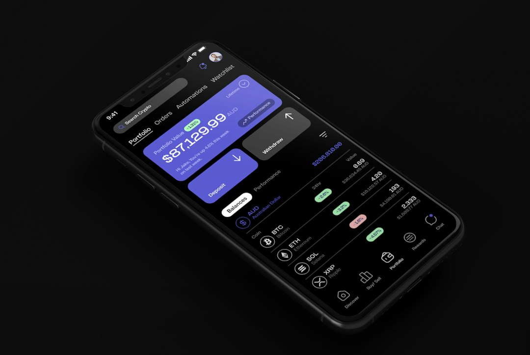
Uizard is built more directly for fast UI generation. You can upload screenshots, wireframes, or even rough sketches. Then it tries to turn them into editable screens.
This makes Uizard fun. It feels more casual than Figma. You can throw in a screenshot of a mobile app and get a mockup quite fast. The result may not win a design award. But it gives you something you can move, edit, and discuss.
That is useful for founders, marketers, product managers, and non-designers. You do not need to master frames, auto layout, constraints, variants, and naming systems before you start.
Honestly, it feels like Uizard was made for the “I need this mocked up before lunch” crowd. And that is not a bad thing.
Uizard is best when:
- You need a fast first draft.
- You are converting app or website screenshots.
- You are testing an idea.
- You are not a design expert.
- You want editable UI without much setup.
- You are making pitch decks, concepts, or early prototypes.
Speed: Uizard usually wins the first round
If your main question is, “Which tool gets me from screenshot to editable mockup faster?” the answer is usually Uizard.
Upload the screenshot. Let it scan. Adjust the result. Done. Not always perfect, but fast.
Figma may take longer because it is more manual unless you use extra plugins. You may need to import the screenshot, trace sections, rebuild elements, fix typography, and organize layers. That can take 20 minutes for one simple mobile screen. More if the UI has many cards, tables, charts, or popups.
Uizard may give you a workable screen in a few minutes. You still edit it, yes. But the first pass arrives faster.
Accuracy: nobody gets a free trophy
Screenshot conversion is still tricky. Both tools can struggle.
Uizard may misread layouts. It may place elements slightly wrong. It may guess colors that are close, but not exact. It may turn an icon into a shape that looks like it had a bad day.
Figma, with plugins, may also miss details. Text recognition can fail. Shadows may be off. Rounded corners may not match. Layer names can be strange.
Here is the simple rule. The cleaner the screenshot, the better the result. Use high-resolution screenshots. Avoid motion blur. Avoid cropped screens. Use a plain background when possible.
If the screenshot is messy, both tools will complain silently by giving you weird output. Rude, but fair.
Editing: Figma takes the crown
Once the screen has been converted, editing matters. This is where Figma shines.
Figma gives you better control over layout, spacing, typography, components, states, variants, and responsive behavior. It is much better for turning a rough converted screen into something your team can actually build.
You can create shared styles. You can use auto layout. You can build button components. You can prepare developer specs. You can organize files in a clean way.
Uizard is easier, but less deep. It is great for changes like moving cards, editing text, switching colors, and making basic flows. But if you need a full product design system, Figma is stronger.
Collaboration: both help, but in different ways
Figma is excellent for team design work. Comments are easy. Multiplayer editing is smooth. Developers can inspect designs. Product teams can review flows without asking for exported files every five minutes.
Uizard is good for early collaboration. It helps people share ideas before the “serious design” phase. A founder can upload competitor screenshots, reshape the concept, and show a quick direction to the team.
Think of Uizard as the brainstorming table. Think of Figma as the build-ready desk.
Best workflow: use both
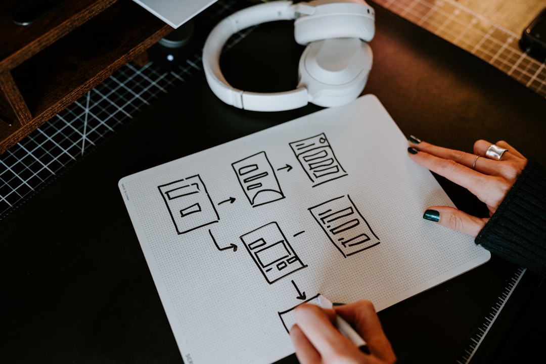
The smartest path is not always Figma versus Uizard. It can be Uizard then Figma.
- Upload your screenshot to Uizard.
- Let it create an editable first draft.
- Fix the obvious layout issues.
- Export or recreate the cleaned version in Figma.
- Apply your real components, fonts, and styles.
- Prepare the final prototype or handoff.
This workflow is great for redesigns. It is also handy when you want to study an existing app screen. You get speed first. Then you get precision.
Which one should you choose?
Choose Uizard if you want quick results from a screenshot and do not want to fight a complex tool. It is friendly. It is fast. It is useful for early concepts.
Choose Figma if the design must become part of a real product process. It is better for teams, systems, and final UI quality.
If you are a solo founder, start with Uizard. If you are a product designer, finish in Figma. If you are a client asking, “Can we copy this screen but make it ours?” please know that designers everywhere just sighed a little.
Final verdict: Uizard is better for converting screenshots into editable mockups quickly. Figma is better for refining those mockups into professional interface designs. For the best result, use Uizard to skip the blank page, then use Figma to make the design clean, consistent, and ready to build.