Websites are used to deliver information and services to customers, whether they are customers of a business or members of an organization. The Internet has become such a popular medium for communication that many businesses have adopted it as their primary means of reaching customers. In addition, many organizations have set up Web pages with information about their mission, goals, and programs they want their constituents to see and use.
We interviewed a web design agency, Dilate digital for their take on best practices:
1. Use the right colors
This is one of the most important things to remember during website design. When it comes to color, less is more. You want your site to look clean and professional, so it’s best not to use too many colors once-especially if you have extensive pages.
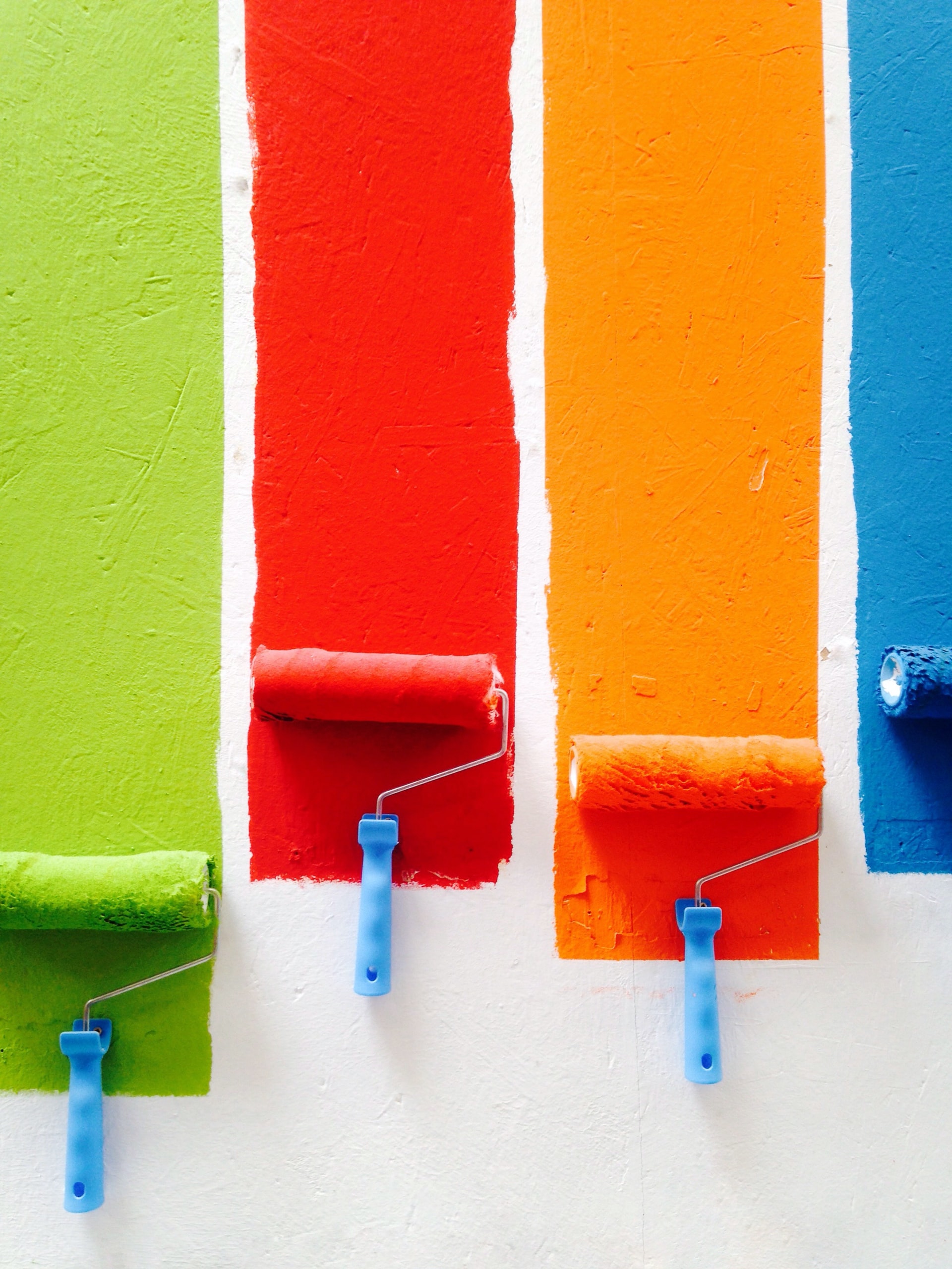
Instead of adding unnecessary colors to your design, focus on creating consistency by using only three or four main colors throughout all pages. It’s also important that these colors match what they represent: if you have a lot of red on your homepage or logo, don’t put too much red elsewhere-it might seem overkill! If possible, choose shades that complement each other while retaining contrast (so they stand out from each other).
2. Make it easy to read.
It can be hard to tell when a person’s eyesight changes. Some people don’t notice it for years, and suddenly, they ask everyone if they have trouble reading their email. If you know someone like that or if you’re one of them-we’ve got some tips for making your website easier to read.
Use a large font size: A good rule of thumb is 14-16 pixels (or 16-18 points) per line with at least 30 characters per line. It’s also important that the screen resolution be set appropriately so that the text is not too small or blurry on high-resolution screens.
Use an easy-to-read font: Some fonts are more difficult to read at small sizes-especially older ones such as Times New Roman or Courier New! To test out how easy it is, try printing off this article in different fonts and see which one is easiest for you!
3. Don’t neglect the power of white space.
White space, or the lack of content, can be just as important as the content itself. When it comes to web design, you want to give your users an easy way to navigate your website. This is why white space should be used in any website’s layout, especially when dealing with a lot of information or text.

White space helps organize the page’s content, making everything look cleaner and more visually appealing. It also allows people to focus on what is important: The message you are trying to convey!
4. Keep your website organized with clear menus, headers, and footers.
When organizing your content, the first step is to keep it simple. A good way of doing this is by using menus or headings to separate different sections of your site and ensuring that each menu item or header is clear and concise.
You can also use footers to provide information about your sites, such as contact details, legal disclaimers, and copyright notices. This will create a more professional look while letting visitors know who they’re dealing with when they visit your site.
5. Make sure your website is responsive.
If you’ve created a website, it should be responsive. The layout of your website should be flexible and adapt to different screen sizes. This is great news for mobile users! They won’t have trouble navigating your site on their phones or tablets.
The font size, line height, and padding should also be adjusted for readability on smaller screens so visitors can easily see everything without zooming in or scrolling horizontally.
6. Consider Mobile friendly design when creating your website.
Mobile-friendly design is important for SEO, accessibility, and usability. Mobile users are more likely to access your website from a search engine than from other sources (like direct traffic or social media). If you haven’t thought about mobile visitors when creating your site, you’re missing out on many potential visitors using their phones as their primary device to browse the web.
The second thing is that many business owners don’t realize how much of an impact mobile devices have on their bottom line because they don’t include them in their analytics reports or surveys. There might be more people using mobile devices than you think!
7. Use plenty of visuals in your design.
Visuals are one of the most effective ways to capture your audience’s attention. Images that tell a story or explain an idea in a way that’s easy to understand can help create an emotional connection with visitors as they browse through your website.
They also make it easier for users to navigate, especially if they’re looking at several pages on the site or evaluating multiple options before making a decision. In addition, images break up text and give web pages texture and variety (especially important when there are long blocks of text).

Lastly, don’t underestimate how much visual appeal matters when designing websites! It may seem common sense, but you’d be surprised by how often this is overlooked – even by experienced designers who should know better! The truth is that people judge books by their covers or websites by their designs.
8. Avoid auto-playing sound and videos on your website.
You may wonder why we’re telling you not to use auto-playing sound or videos on your website. Well, a very simple reason is that users don’t like it. According to Google’s data, around 70% of people will leave a website if they hear an auto-playing video. Nearly three out of every four visitors will move onto another page if they hear even one second of a video without their consent.
9. Good visual hierarchy makes important information easy to find
Visual hierarchy is the arrangement of elements in a way that gives importance to the most important elements and deemphasizes the less important ones.
It’s an essential part of web design because it helps users quickly find the information they need. Still, visual hierarchy must also be applied carefully not to overwhelm visitors.
In a nutshell
The first step to designing a website is understanding your target audience’s needs. Then, you should create an outline for the content that will appear on each page and decide how it should be organized. Next, determine what type of layout would work best with this information. Finally, you need to choose some colors for your design that match your site’s overall theme or feel-but don’t forget about contrast!